
Butter yellow: the secret star of Milan Design Week 2025
Butter yellow has quietly but firmly crept into the interior - and from Milan Design Week straight onto our wishlist. Why? Because it looks as good as butter tastes.
Following a common thread through Milan Design Week is about as easy as getting hold of a Negroni Sbagliato in the same week without queuing. The trends are too diverse, too many labels are entering the scene with their own visions. And yet there was one common denominator in 2025 that could not be overlooked: butter yellow furniture.
From the glossy showroom at Tacchini in Brera to edgy offspaces in Tortona - the gently melting yellow colour was spread across numerous rooms like warm butter on toast. Sometimes as an armchair, sometimes as a wall shelf or as a candle combined with a soft shape.
Freshly whipped up: buttery yellow designer pieces
Tacchini dropped the Butter Sofa collection by British designer Faye Toogood in the new Tacchini showroom, an old townhouse in Milan's Brera neighbourhood.


The sofa collection was soft to the touch down to the last detail. With its smooth, rounded corners and a colour palette reminiscent of the creamy tone of margarine, it cut a fine figure. The same applied to the foam armchair «Lapis Lazuli» by up-and-coming designer Pablo Octavio from the Deoron group exhibition.

In the Visteria Foundation exhibition, the Polish Institute of Craft and Design Art, in the exhibition «Romantic Brutalism» there were buttery wall shelves, while in Alcova there were candles that looked like stacked butter.


The wax sculptures «EPS Candle» are the work of Berlin-based designer Malte van der Meyden. They are inspired by organic shapes and natural silhouettes - perhaps even margarine.
Out of fashion
The hype surrounding the colour comes straight from the fashion world. The first butter yellow pieces appeared in 2023 in the pre-spring and resort collections of major fashion houses, such as Jacquemus, Miu Miu and Gucci. The colour was also occasionally seen in street style looks, often combined with bright orange, green or brown.
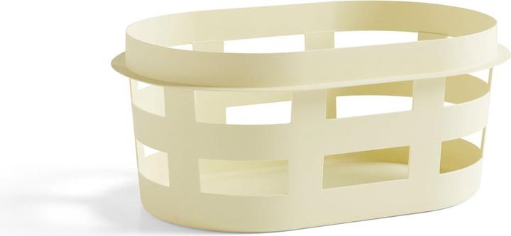
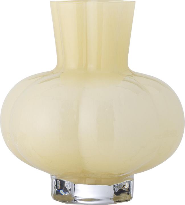
In the interior world, brands such as Hay, Ferm Living and &Tradition showed butter yellow accents in cushions, vases or lamps for the first time - mostly as a highlight colour in neutral settings. Since Milan Design Week, however, one thing is certain: the colour has finally made its way into interiors, where it feels right at home.
Why it's worth colouring your home
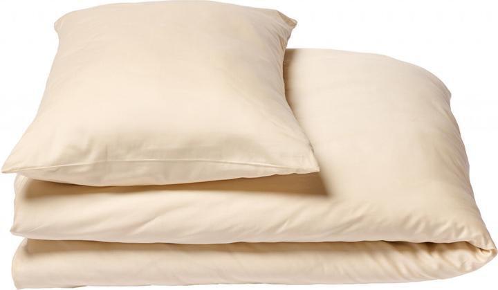
And why this colour of all things? Because it brings warmth without imposing itself. Because it radiates freshness without being overpowering. And because it bathes everything in a little bit of sunshine, gently plays around textures and makes rooms appear soft. Anyone who wants to bring this colour trend home can use it to smear some breakfast butter over their interior.
Like a cheerleader, I love celebrating good design and bringing you closer to everything furniture- and interior design- related. I regularly curate simple yet sophisticated interior ideas, report on trends and interview creative minds about their work.


